Steal this content! Everything on this site is under a CC0 license, so you can copy/paste this handoff without guilt.
Hello designer friend (BTW, did you know so1ve is looking for talented freelance designers?)!
There are some nuances to designing for frost specifically, and to some extent Drupal in general, that tuning into can help you design in a way that makes the developers happy and keeps the project moving quickly. Don’t worry, though — there’s still plenty of room for creativity.
Before we jump into the design stuff, you may be wondering, “Why are we using this frost thing rather than something else?” That’s a good question, and effectively it comes down to this: frost is a huge head start for making websites that can later be extended to manage huge amounts of content.
The frost system came from turning a bunch of designs by a bunch of designers into component-based websites, reusing what worked from the previous site each time, until the system seemed to work for any design. The setup may not be precisely what you’re used to, but it works really well and you might end up really happy with how easy it is to customize.
We’ll start off easy and breezy, just send along an SVG logo or two, but quickly this handoff article becomes a deep dive of all the possible components you may encounter on your design journey. When you’re deep in the atomic component trees, you are hereby empowered to remember that you can plant any darned forest you want. This frost system allows you to click-and-drag your way to websites that other systems simply cannot match.
If you’re not accustomed to trying out a site early in the design process, a frost site is a great time to buck that trend. All the principles in this guide can be explored directly from a frost demo site, if your developer is up to the task of setting one up.
Table of contents
- First, where to reference
- Second, brand assets
- Third, base styles
- Fourth, component party!
- Fifth, wrapper
- Sixth, page mockups
- Wrapping up
First, where to reference
Soon we’ll have a Figma starter for frost sites, which hopefully will be a big boost. In the mean time, these links have useful info for referencing much of what we’re discussing in this post:
- frost component guide — demos of most components, with some helpful descriptions
- frost style guide — the base styles applied to Drupal’s built-in user interface elements
- Example ‘system’ page — a ‘boring’ page, which is a great template target
- settings.css — one little file that holds all the base styles
Second, brand assets
Especially at the start, just two logo files — one for the header and an inverted one for the footer — is enough for testing development versions of the new site. But there are plenty of other assets to cut and send to your friendly neighborhood developer:
| Image | Format | Dimensions | Notes |
|---|---|---|---|
| logo.svg | SVG | 64x64, approx. | If possible, provide the logo as a real SVG file (rather than a JPEG/PNG embedded in an SVG wrapper). The header layout will constrain the image's size, but scaling it to be nearly the size it should appear on the site can be a page load performance boost. 64-100 pixels for the height is a good target, with the width being more flexible (for instance it could be 240-ish pixels wide if the image contains both the mark and text). |
| footer-logo.svg | SVG | 64x64, approx. | Even if the header and footer will eventually have the same color scheme and the same logo, it's fun to make the "evil twin" version of the logo. This inverted version is intended for rev. 1 of the footer, and could be repurposed down the road. |
| favicon.ico | ICO | 64x64 | This appears in the browser's tab. 64x64 is probably big enough. The file must have square dimensions. Most often you'll want the logo mark over transparency, but a solid background is also possible. Very simple brand expression is the name of the game here. |
| apple-touch-icon.png | PNG | 512x512 | Icon used when installing the site to your desktop or home screen. In order to avoid providing a ton of slightly-varied versions of the same asset, ship the big 512x512 version with just the logo mark, a solid color background, and at least a little padding all the way around the logo. |
| bg_hero_default.jpg | JPEG | 1920x1080 | On system and other pages where a custom hero isn't set up, this image can be used as a default hero background if desired. It should be either dark with a mask for white text, or light for dark text. If you'd prefer a solid color or CSS gradient background for default heroes, just let the developer know. Making a default hero image might be a good design exercise anyway. |
| social_default_1200x630.jpg | JPEG | 1200x630 | Social sharing image for Facebook/LinkedIn/Twitter. The template for making the image is available as an XCF for GIMP, and online converters to PSD are easy to come by. |
Along with the brand assets above, now might be a good time to source backgrounds for various stripes in the default content (more on stripes later):
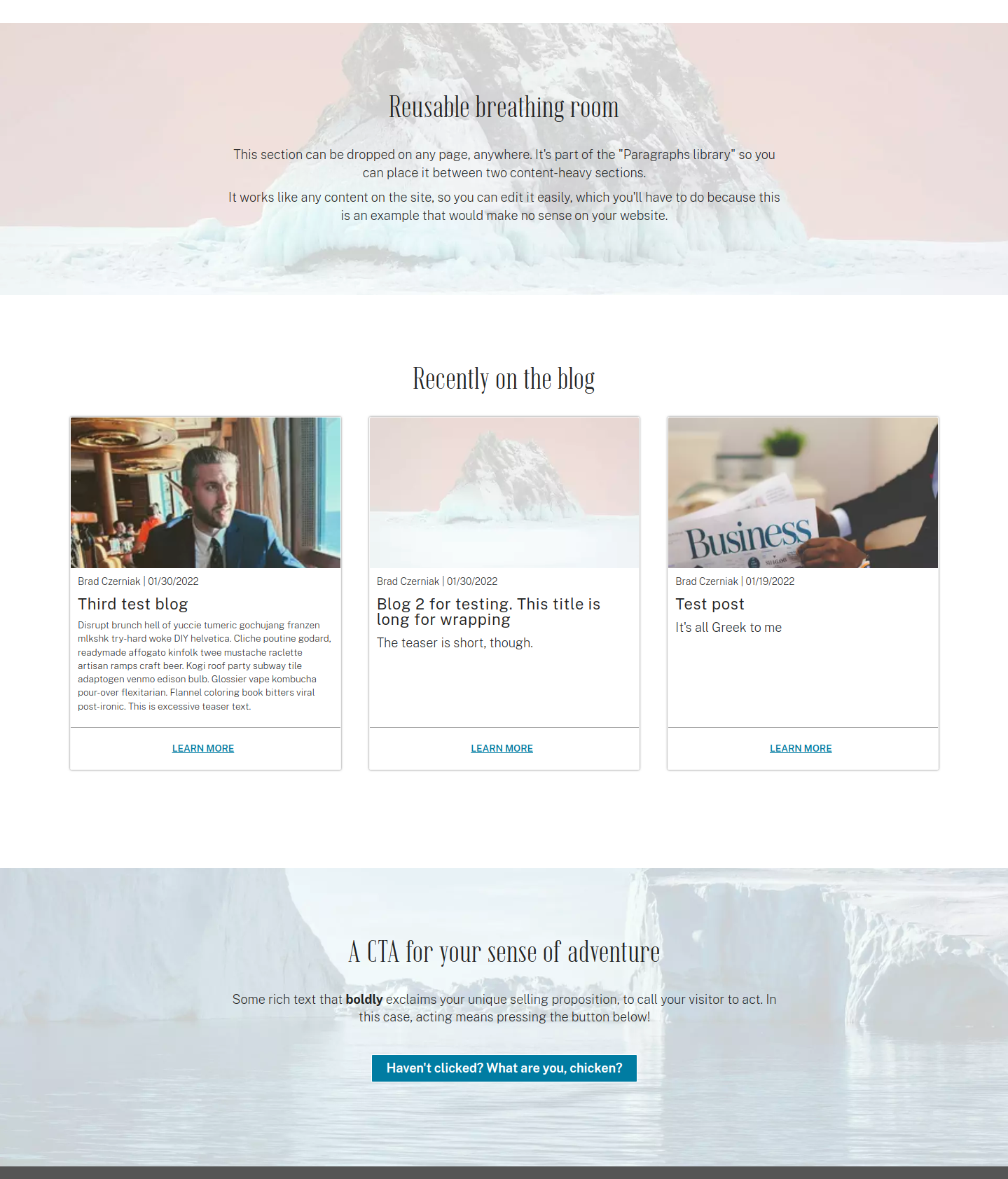
When the developer installs frost, the section backgrounds are stock photographs of icebergs with semi-transparent white masks. Unless you’re making a site about icebergs, the default section backgrounds should probably be changed. However, this piece can be deferred until content and page design, later in this post.
Third, base styles
The base styles in the settings.css file define reusable variables for both implementing a consistent design, as well as to help the front-end developers out with repetitive tasks. Overall, you can get an idea of the contexts for how the base styles are used from this site’s moodboard.
Fonts
For the most part you just need to pick two fonts, with the notes below helping clarify the format and how they’re used:
- Primary font — body copy and other defaults
- Secondary font — headings h1 and h2 by default
First in the file are @font-face declarations, which is how we import web-compatible font files. For frost and pretty much any modern site, we strongly prefer variable fonts for the smaller number of files and fine-tuning ability — you can tweak the font weight to be fractions between semi-bold and bold, for instance, which is not something you can do with classic fonts.
The baked-in design system is set up for two main typefaces: one for headings (mostly) and another for body copy and everything else. If the site is going to show a lot of code or other monospaced text, a third web font would be added, though the monospace stack uses 'courier new', courier, monospace which will work in a pinch.
(Note more for the developer but still useful…) If the brand is centered on a single font, you can remove the @font-face declaration for the second font, but rather than deleting the --font-family--secondary custom property or any of its usages, it’s probably a better long-term decision to just duplicate the primary stack to the secondary variable.
One last font concept: the default frost setup has a sans-serif for --font-family--primary and a websafe stack following the custom font. Similarly, --font-family--secondary is a serif with a websafe serif stack. When in doubt, replace the name of the custom font, but leave the websafe stack for fallbacks. If you know what you’re doing you could switch the websafe stacks to better match the custom faces (swapping Times New Roman out for Georgia, for instance), but that can be considered a micro-optimization.
Colors
The frost design system leans heavily on the color scheme setup, so please try to stick to what we have here, at least at first, as that’s one of the biggest ways to keep the front-end development scope in check.
Up front, we have white, ‘black’, and three shades of grey, plus three shades of each brand color (medium, light, and dark). As a bonus there’s a fourth medium-lightness accent color available:
Here’s white/black/greys:
We can add more greys if needed to style components, for instance, but these would be the greyscale options available when choosing background and text colors in the content-editing interface.
- #222
- #555
- #aaa
- #f7f7f7
- #fff
One notable thing is that our black is #222 rather than #000. This comes from Iam Storm Taylor’s advice, and we recommend going further and putting some brand colors in your ‘black’ hex code!
And the medium shades of the three brand colors:
The medium shades should have a lightness around 50% (40-60% is a good range). The ‘main’ color should be the most blue of the brand colors, even if it’s not the brand’s main color in the branding sense. This choice comes down to making links look as blue and underlined by default as possible.
- #007599
- #E32416
- #00838a
And the light shades:
For WCAG contrast compliance specifically, the light shades should be perhaps 90% lightness or higher. Often this requires bringing more white into the mix, effectively pastel-ing the colors in the process. The light shades need not be pastel, but it seems those shades end up being the most versatile for contrast.
- #ccf4ff
- #ffcfcc
- #ccfcff
And the dark shades:
The dark shades could be a bit lighter than 10% lightness, but like the lightness choice for the light shades, the darker the dark shades the more contrast-compliant combinations will be available to use.
- #002733
- #331716
- #003033
Any one of the dark shades might be a good candidate for the faux-black, too.
Here’s the theme accent color:
By default the accent color is used for visited link coloration and a couple other one-off component elements. If your brand scheme contains a not-super-important purple, this is a good place for it. Otherwise, whichever brand color is least important of the top four is good as an accent.
- #6100a7
Delivery
In the developers’ ideal world, you’d deliver the colors just like how they appear in settings.css:
:root {
  /* Main theme colors. */
  --color--black: #222;
  --color--grey-dark: #555;
  --color--grey: #aaa;
  --color--grey-light: #f7f7f7;
  --color--white: #fff;
  --color--main: #007DA3; /* This should be a 6-char hex with uppercase letters. */
  --color--main-dark: #002733;
  --color--main-light: #ccf4ff;
  --color--second: #e32416;
  --color--second-dark: #331716;
  --color--second-light: #ffcfcc;
  --color--third: #007e85;
  --color--third-dark: #003033;
  --color--third-light: #ccfcff;
  --color--accent: #6100a7;
}
The exact format isn’t super important, though. Just so long as there’s three brand colors with three shades apiece. Most developers can translate between RGB, HSL, hex codes, or other color formats, so as long as you’re not giving Pantone names or something you’re probably in good shape.
You can see in the code sample above that the --color--main should be a 6-character hex code with uppercase letters. This quirk is to facilitate an automatic color scheme for the interactive charts and graphs (see the table section of the storytelling components). If you’d prefer to hard-code the color scheme for charts and graphs instead, provide your developer with a list of at least 10 hex codes that comply with the Highcharts color settings, like:
[
  "#2caffe",
  "#544fc5",
  "#00e272",
  "#fe6a35",
  "#6b8abc",
  "#d568fb",
  "#2ee0ca",
  "#fa4b42",
  "#feb56a",
  "#91e8e12"
]
This is purely optional, as the auto-generated colors are usually pretty good, and those colors only matter if the site plans to use the charts and graphs prominently.
Everything else
The remaining default styles can be the difference between a ‘flat’ aesthetic and something with a lot of depth and playfulness. Various pieces of the theme, by default, use the borders, shadows, and transitions, so tweaking these to match the brand feel early on can make the site feel entirely different from the starting defaults:
--border--default— default is1px solidbut you could pick thicker and/or switch to dotted or dashed for a custom feel--border-radius--default— 2px is default, which is a subtle rounding. 0 is square, 1em is quite round, and 25% is circular--box-shadow--default— default is0 0 3px rgba(0, 0, 0, .5), which is a tiny, spread black shadow straight down--layout--content-area— default is1280px, which you should only change if you have a good reason (narrowing it to as little as 900px is more workable than widening)--line-height--default— default is1.425. This should be a unitless number between 1.2 and 2.5 for legible body copy--line-height--heading: it’s1by default, but something from 0.9 to 1.4 might work for your headings--spacing--single— set to0.625remand should probably remain that way, as it makes a single spacer 10px tall--text-shadow--default— default is0 0 2px rgba(0, 0, 0, .5), which is even subtler than the box shadow. Text shadow is used sparingly by default--transition--default— default isall .3s ease-in. For performance you may want to pick just background-color rather than ‘all’, and maybe a different easing function if you have a sensitive eye. 0.3s is a good balance of perception without delay
As you can see for some of the notes, the default value is dialed into “best practices”, so in many cases the values would only change by a small amount. If you’re working over a developer’s shoulder on a scrum team, these are things you two could dial in after the bigger decisions are settled.
Fourth, component party!
Now we’re cooking with gas.
frost is all about Atomic Design, so be prepared to think through the smallest-level ‘atoms’ first, and then put those atoms together to create the full experience. The more we stick to that concept, the better both our code and the design system will be!
Tags in the style guide
If you look at the frost style guide you’ll see there’s a lot of HTML tag type stuff that isn’t likely to need changing:
- Users are most comfortable with hyperlinks that are blue, underlined, or both. There’s room for creativity, but that’s the best starting point
- Bold text should be bold. Changing the
<strong>styling to italicized or underline or another style could have unintended consequences - Similarly, changing the
<em>styling from italicized to something else could be accidentally bad
On the other hand, there’s a lot of room for creativity when it comes to:
- Horizontal rules, which could look however you’d like as long as they divide two blocks of text
- Forms and all the form controls
- Blockquotes
- Buttons and CTA button links
- Lists, mostly their indents/hangs and markers
- Tables, though keeping them simple might save trouble
- Default headings for levels h1-h6
- Pagers
- Progress bars
- Breadcrumbs
There’s some overlap between the tag-level and Drupal core components in this section and the reusable components below. For the most part, defining how a tag-level style looks first can be helpful from a technical perspective, since any component that uses a default tag but doesn’t look like a default tag has to override it. Not setting correct defaults early can result in duplicated override code, so let’s get the atoms figured out first.
Reusable components
The components in the frost content-authoring toolkit come in a few different flavors, so we’ll subdivide them here and go into way more detail than you asked for. That way you’ll have something to reference for the why of various design decisions.
Sectioning
The sectioning components hold the storytelling components below, with Stripes (there’s one stripe type, ‘atomic’, included by default in frost, but others can be added) being big containers with lots of options, layouts putting one or more columns side-by-side, and stripe collections used to make tabs or even the dreaded slideshows.
Stripe: Atomic
The cornerstone of the design system; an infinitely-flexible section container.
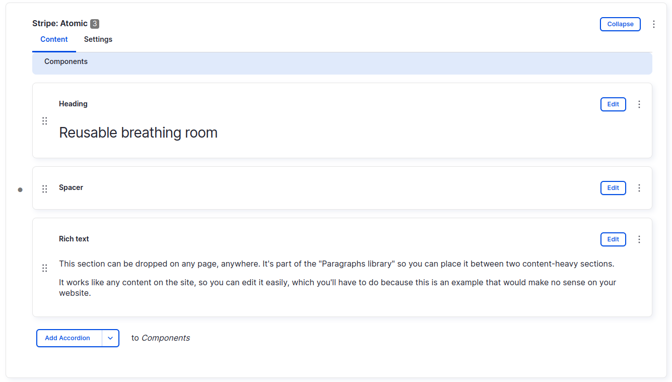
When you’re on the edit screen, in the content tab, you enter the components that should live inside the stripe container:
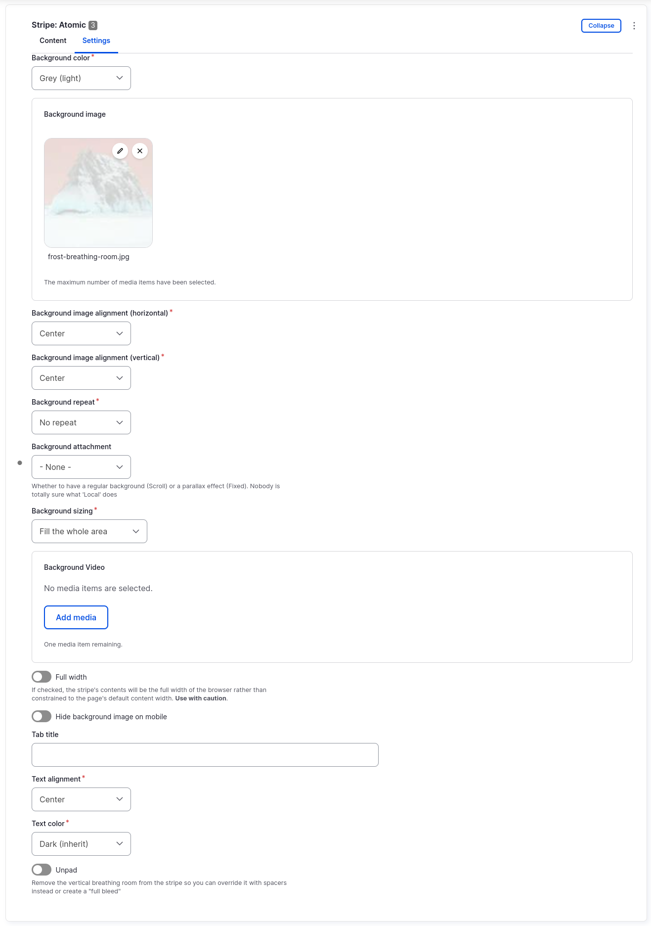
Then, in the settings tab, you can style the stripe to have a personality, while still meshing with the site’s brand:
As you can see, a stripe has lots of available settings, with some self-explanatory and others that could use a little clarification:
- Background color — Theme colors you can set. If you use a background image, please set a color that similar to the darkness of the image being used. Also make sure the text color contrasts with the set background color
- Background image — Reusable images that appear as the background
- Background image alignment (horizontal) — A focal point horizontally. Most useful for ensuring you show the area of interest when the screen narrows
- Background image alignment (vertical) — Focal point vertically in image. Usually good centered, but should be set to ‘top’ when the background image contains people in a medium shot so you don’t cut off the top of their head(s)
- Background repeat — If you use a tiny image, you can tile it as a pattern. Be sure to change the background size if tiling
- Background repeat — Jk. Repeat, get it?
- Background attachment — Whether the background should stick to the page or act like it’s behind the page like parallax scrolling
- Background sizing — Usually fill the whole area. Can also do tricky things
- Background Video — Reusable video file that lives on top of the background color and image, but underneath the stripe’s content
- Full width — Eliminate the maximum content area width, and have the stripe go all the way to the screen edges on big screens
- Hide background image on mobile — If the background image is ‘busy’, hide it on narrow screens, falling back to the solid background color
- Tab title — If this stripe is used in a stripe collection, type what the tab should say here
- Text alignment — Left, right, center, justify. Please never use justify. Since layout columns have text aligned left by default, aligning stripes center by default gives the most effective use of space when all the components are used in combination
- Text color — Light or dark. Please match it to the background color you choose (the one that matches the darkness of any background images used)
- Unpad — Remove the top and bottom padding from the stripe so it’s short and has less breathing room
A stripe, by default, has 20px horizontal padding to give your thumb a place to scroll up and down without accidentally tapping links and stuff. It also has 100px vertical padding (for desktop, it’s 60px for mobile) for pleasant and up-market whitespace breathing room. The padding can be removed on a per-stripe basis using the Unpad checkbox described above when you want to dial in less than the default amount of vertical padding. If you’d prefer a different amount of padding on stripes by default, proportional to other spacing throughout the site, the developer could tweak the following line in utility--layout.css:
.layout--stripe {
  padding: calc(10 * var(--spacing--single)) calc(2 * var(--spacing--single));
}
As noted in the list of settings above, you can also override the --layout--content-area width for a particular stripe, in the event you want to show some really wide foreground content on big screens.
Layout
Layouts in frost are a little bit different/better than other site-building systems, in the following ways:
- Each layout component is a single row of columns. Below “portrait tablet” size, the columns stack vertically for responsiveness
- You don’t choose a two-column or three-column or whatever layout, you just pick layout and then add the columns you want. If you want your two-column layout to be a three-column later, you don’t have to rebuild it, just add the next column
- (More of a developer note) Rather than Layout Builder in Drupal, layouts in frost are themselves components, so you can place layouts anywhere you can place other components, and put layouts in layouts in layouts if your designs need it
- Rather than a grid system, the columns are proportional to each other. One medium and two small columns gets you to a 50%-25%-25% row
- Empty columns can be used without issue, and will automatically disappear on narrow screens when the columns stack
- If you have a series of layouts that had an image in one column and text in the other, and you wanted them to alternate visually on desktop but be in the same order when stacked on mobile, the ‘Reverse’ checkbox makes that super easy
- Each column has a bunch of dials and switches for spacing, which we’ll get into next
Column
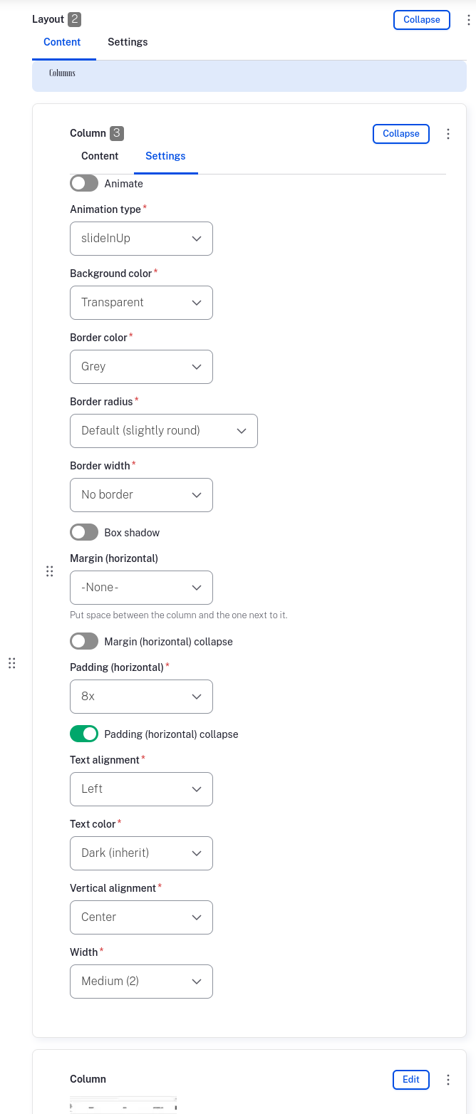
Columns have a lot of options that let you dial in their desired appearance and do some tricky things:
- Animate — Unchecked by default, but check it to use the chosen animation below
- Animation type — Any of the reveal animations from animate.css
- Background color — Usually transparent, but can be a solid color where wanted
- Border color — Can be set to any of the theme colors
- Border radius — Whether the corners should be square, slightly rounded, or fully rounded. Can be used even without a border
- Border width — Anywhere from the “No border” default to
4px solid(or other values with developer help) - Box shadow — Applies the site default drop shadow as set in the “Base settings” section way up this page
- Margin (horizontal) — Space between this column and its neighbors
- Margin (horizontal) collapse — When you want space on desktop by not on mobile
- Padding (horizontal) — Interior space for columns containing text (usually). Important note: in frost, horizontal space is usually configurable, while vertical space is set with a combination of “Vertical alignment” and spacer components. This makes more and more sense the more you use this philosophy
- Padding (horizontal) collapse — This is the “why doesn’t this block of text line up vertically on mobile?” checkbox
- Text alignment — Left, right, center, or justify. Each column can have its own settings, for tricky layouts
- Text color — Like stripes, the options here are light or dark, for contrast with the background color. Don’t worry: if you want a heading or some rich text to be a brand color, we’ll show that option in the storytelling section
- Vertical alignment — Defaults to ‘center’, though ‘top’ is another common one. Oftentimes you want a text column to be aligned to the top of the row, but the image to its side vertically centered. There are less-used options in the dropdown to align the column’s contents to the bottom or to have them spaced out in the column’s vertical area
- Width — Proportional sizes, so you can make any fraction/percent layout you need (within reason). Every column starts life as a ‘small (1)’ but can be promoted to bigger sizes as needed
Stripe collection
Reuses the stripe concept to allow content creators to make tabs (and slideshows with a small amount of development work. We couldn’t include slideshows in the frost system in good conscience, as we’re still wondering should we use a carousel? ).
The tab controls can certainly be re-styled to match your brand’s aesthetic, noting that the tabs in the Stripe collection component share HTML classes with system tabs, so for consistency it’s best if all tabs on the site look the same.
For content entry especially, there are two big notes to keep in mind for using a Stripe collection to do tabs:
- If you’re making a lot of tabs on the site, it’s worthwhile to get comfortable promoting components to the Paragraphs library
- Each tab needs a tab title set in the ‘Settings’ for the individual stripe
Overall, things like on-page tabs and slideshows are interesting UI elements, but should likely be used sparingly and with a clear purpose in mind.
Storytelling
The storytelling components are more at the atom/molecule level for the most part, compared to the sectioning components which could be considered more organism-ish. Demos and detail are available at the frost component guide so the notes here focus primarily on design needs.
Accordion
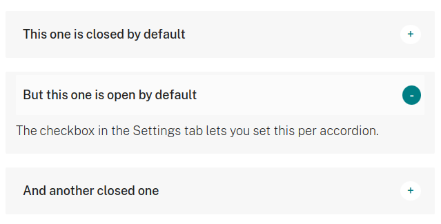
Accordions are ‘expandos’ for initially showing a title that explains what the expanded content box contains. A user can toggle the accordion open/closed via click/tap or keyboard/other controls from assistive technologies.
Many design systems mandate accordions be placed in groups, and often use JavaScript to ensure only one accordion is open at a time. frost eschews this, in favor of letting the user toggle whichever elements they want. It’s the most versatile and simple approach.
Design notes:
- Accordion titles in frost, by default, are plain text, with no icon or other indicator. Icons or rich text would require extra development
- The body of regular accordions is a rich text WYSIWYG. An accordion using components as the body would be extra development. Not to speak out of turn, but any project that requires really involved disclosure elements may be abusing those elements’ typical purpose
- The frost component system has accordions as well as the aforementioned “Stripe collection” tabs, with both filling the role of a disclosure element: showing a little bit of information that a user can then choose to toggle open for more information. Unless there’s a compelling unanticipated reason to add more or replace the existing components, project designs should probably stick to just two disclosure element types
- Content editors can set any given accordion to be expanded by default from the settings tab. Note that browsers may also expand the accordions if, for example, a search engine links the user and the result text is inside the accordion
- There’s something of a debate about whether the control+indicator for openness/closedness should be on the left or right. In frost we went with the right, making the choice largely to facilitate scanning the titles easily. Since the entire title section can be clicked to toggle the state (and the cursor lets desktop users know this), a user need not move their mouse a lot to click the control, unless they really want to
- Similarly, there’s room for refinement when it comes to the indicator. HTML
<details>elements are typically styled in the browser by default with a “disclosure triangle” icon, with many design systems preferring a chevron. In frost we’ve gone with a plus when closed and a minus when open, as these symbols represent more/less and are less ambiguous about state than the direction a chevron or triangle is pointing
All that said, you have the freedom to design the accordions to look (and work, insofar as scope and developer talent allows) however you’d like, especially as it meshes with the project’s brand.
Block
System, custom, and dynamic blocks. For the most part these blocks being placed will each be styled according to their varied contents (see the frost component guide for the likely culprits).
At least two of the coolest custom blocks that can be placed contain social icons, so determining what the social icons (which use Simple Icons under the hood) should look like in general could be a boost for the blocks, as well as the same block(s) possibly being used in the footer:
- The icon itself can have the fills/strokes styled to white or any other solid color. It’s potentially possible to do a gradient or other effect, too
- It’s possible for the fill/stroke of a particular icon to be that brand’s preferred color, though setting up the styles for lots of icons of varying colors could become a large part of the front-end scope
- Each icon is wrapped in an
<a>tag to link it to the respective social site, and that tag can be styled to contrast the chosen fill/stroke of the icon proper. By default the wrapping link has a black background and appears as a circle due to equal height+width and fully-rounded corners. It should be trivial to change the background color, active/hover/focus state styles, padding, and other styling, to switch to more-square containers, etc. - The path of least resistance is to keep the icons themselves white, and pick a solid background color that works for all icons to be used
- While it’s possible to switch icon libraries to something like fontawesome, that could present scope issues if your project has lots of front-end customizations. So, if the simple-icons GMail icon, for instance, looks too much like the Medium.com ‘M’ and not enough like an email envelope, please consider swapping it out for the simple-icons “Invoice Ninja” or “Microsoft Outlook” icons before mandating a substantial swap or addition of icon library. This email icon issue is odd, because all the other icons are for brands, while email is more of a concept(?), not to mention that the mailto: icon is likely to be under-used, so it might be easiest to just remove it entirely if you plan to use social blocks. A more generalized icon library with a few brands mixed in, like fontawesome, would give you multiple good options to represent email, but may not have representations of every desired brand, so it’s a trade-off for sure
Blockquote
Rich text as a pull-quote:
The blockquote component’s Settings have toggles, each enabled by default, to insert stylized double-quotation marks before and after the contents of the rich text, respectively. These settings can instead be hidden or removed if you prefer a different style for pull quotes.
Design notes:
- The quote, owing to being a rich text WYSIWYG, can contain all kinds of bold, italic, heading, code, and other markup. In practice blockquote are used for quotes, though, so it may be most pragmatic to ignore lots of formatting
- The double-quote affectations can be set from either of the fonts chosen in the “Base styles” section. If neither of those typefaces has quotes to your liking, a websafe font like Georgia might be a good pick. Otherwise, it will be a tiny bit extra front-end development to use images instead. One reason to stick with fonts is that it’s easier and more reliable to re-size them responsively, and of course it requires loading fewer front-end images/assets so there’s the performance angle to consider, too
- If you decide to go another direction for blockquotes, like the common thick-left-border plus background style, collaborate with your developer about whether the border and/or the background should be configurable by content authors
- Overall, blockquotes tend to have a font-size a bit bigger than regular body text, and frequently use italicized text as well. That’s the common pattern, but is not a requirement per se
Cards
A side-by-side layout of cards that don’t represent other site content.
The “don’t represent other site content” part is important here, as there are ‘listing’ components described below for representing content, media, products, tags/terms, or users, as well as the Views component for showing listings of those types of content and more. That’s not to say that a card can’t be used to tease and link to an article on the site, as an example, but if content authors are doing that frequently then they should probably discuss a better way to solve a particular content problem with the dev team.
The ‘Cards’ (plural with an ‘s’) component holds one or more Card (or Card: Percent) components. The Cards container has one setting, letting you choose if the cards it holds should be stacked vertical, shown side-by-side, or in a carousel.
For the most part, there’s not much to style at the Cards container level, unless the native horizontal scroll-snap-based carousel should instead use a JavaScript library, which of course would be some additional amount of front-end development.
Card
An individual card has four fields:
- Image (optional, reusable)
- Title
- Text
- Link (URL and link text are both configurable)
Cards typically have a set-it-and-forget-it style site-wide, often inheriting things like the default amount of corner-rounding and box-shadow from the base styles. Like all components, though, individual cards can have individual settings, so 99% of cards could have a transparent/white background, but one card could be set to have a pink background. It depends on your site’s needs, but the absence of these settings by default is intended to promote consistency across cards.
Card: Percent
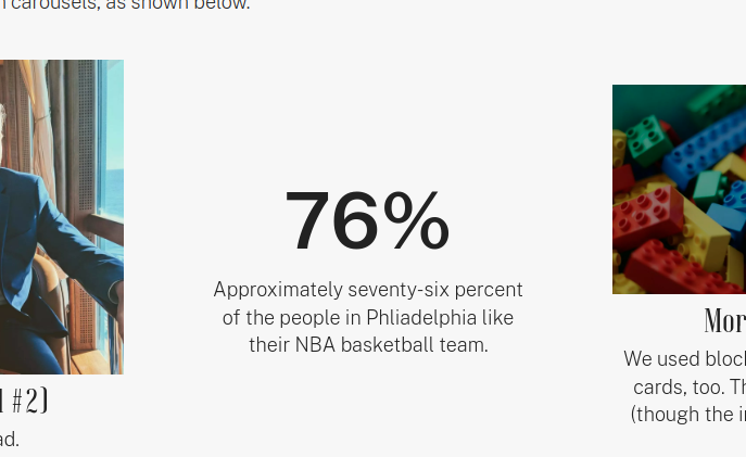
This additional card type is used to highlight a top-line number, with optional animation. When a number is important for telling your story, either this type of card or a table with chart/graph is a good way to convey the info.
Card: Percent has three content fields by default:
- Number for the number itself. It can be integer or decimal, and the animation script will deal with it just fine
- Explanatory text as the body of the card
- Link as an optional way to send people toward details for a statistic, for instance
Additionally, there are two available settings for a percent card:
- Prefix so you could put a
$in front of the number and the animation will still work - Suffix for a
%or something like that, also not affected by the animation
Some design and functionality notes:
- At install-time the animation is set to always occur. It should be mostly trivial to add a toggle allowing a content author to turn animation on and off per card
- The animation counts up from zero in increments that should cause the animation to complete in about 2.5 seconds. If you intend to show how small a number is (A “We’ve reduced this metric from big to small” story), that will be another thing to talk to your developer about. The alternative would be to turn the small into a large by saying “We’ve reduced this metric by a staggering 144%” instead
- All five configurable fields can be styled separately, and technically the
Card: Percentcan be styled to appear different from other card types. This most comes into play if you want the number itself to be big and bold, but the prefix/suffix to be smaller and lower-contrast
Content listing
A content listing, like other components below that end in the word ‘listing’ (and to some extent like Cards), lets you choose one or more pieces of content, put them in any order you deem appropriate, and display them as:
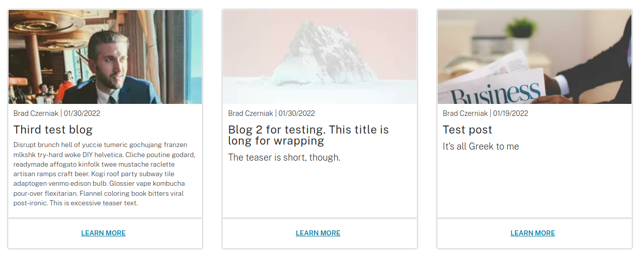
- Teasers, where the image, byline, title, teaser text, and “Read more” link appear card-like
- Small, which is configurable of course, but is usually just the title in a bordered box
The teaser/small representations of content on the site (articles, events, pages) can be displayed the same ways as cards and other listings:
- Stacked vertical column
- Side-by-side (out of the box it’s 3 wide then wraps, but could be set to 2, 4, etc.)
- Carousel
Each content type could have a different appearance if desired, but let’s just talk through some overall notes:
- The entire teaser is clickable/tappable to go to that content’s page, and desktop users get a pointer cursor and a hover style to go with it. Out of the box it’s a slight background darkening, but you may want the teaser image to zoom a little bit or something else more pronounced
- There’s likely a benefit in your site’s design system, like the concept of a ‘card’, to make all ‘teaser’ (and ‘small’ if used) representations share design cues/metaphors. While an article and a user are two different things, both can have an image, a prominent label, some intro text, and a CTA link, so containing those elements and giving them some aesthetic consistency could serve to make users familiar with what teasers do on the site (ie. link to the full page)
- Listing components differ from cards in that each individual teaser cannot be readily set to, for instance, have its own signature background color or other atomic styling choice. This is certainly possible if you need to do it, but it may be a bit clunky for authors
- Like the Cards container, there’s not much to design for the Content listing component itself, outside of introducing a JavaScript library for the carousels. The big design lift is deciding what the ‘teaser’ metaphor should look like
- You can see in the screenshot above that the “teaser text” can be styled to be bigger or smaller, depending on how long the text is. This isn’t required, but may keep things in-check and pleasant. There is a risk of the teaser text becoming inaccessibly small, though, and you’re most likely to hear about this issue from your SEO specialist, who will get notified of the issue through Google Search Console
Heading
The heading component gives a plain text box for the contents of <h1>-<h6> (plus a “Regular text” option for when you need some text to look like a heading without messing with the document outline), with plenty of styling options:
- Appear as heading level so you can create a good document outline but also visually communicate however you want
- Font weight, hopefully used sparingly, so in a pinch you can have an
<h2>that differs from others and catches the eye - Icon for design systems where headings are sometimes/always also represented with a visual
- Text color so you can use the brand colors in stripes with different backgrounds, display more variety in text, etc.
- Text transform to avoid the icky situation where authors are forced to enter their text in all-caps just to match a design. If you enter the text in natural case and then use the
text-transformoption, you have easier options if a user complains that the site is yelling at them. Not so much if you enter the content with a weird casing strategy
As insinuated above, the key role headings play for users of all abilities plus search engines is to create a hierarchical “document outline”. It’s not uncommon for designers, though, to create a style guide or moodboard with 4-6 heading levels, and then in practice use them where they look best visually rather than where they’re appropriate in the hierarchy. The frost heading component lets you use the appropriate heading level and the set the heading to look like a different level, but… that should be avoided if possible.
Here are some guidelines for how headings are used in frost (and lots of other Drupal/other sites), which will hopefully be useful for creating the headings’ type scale:
- Ignoring the alternate history we could have had based on earlier drafts of HTML5 where you’d have been able to contain various heading groups on a single page, in this timeline it’s standard practice for a page to only have one h1 tag, and for that tag to be the page title
- I’ll repeat this later in the guide, too: a quick and easy way to tell if a page design (aside from the home page, which is allowed to not appear the same as ‘interior’ pages) is a good citizen of the internet is if the pretty URL path, the title in the browser tab, the label for the page in the main nav (if present), and the visible on-page h1 title all match. There can be a little deviation, but matching all of those things makes navigating the site and knowing where you are a lot easier
- Similar to the point above, with little deviation, all h1 page titles should be consistent in size, location, and overall appearance from page to page. Spoiler alert for the page design section later in this post: I strongly recommend every page design have as consistent of a hero as possible, with only “Landing Pages” introducing more visual interest in the hero in the form of background images and such
- Every stripe/section’s first text should be an
<h2>tag in the markup order, even if that h2 is in a layout column - Teaser titles in listing components should be
<h3>, given the usages of h1 and h2 described above - Regular
<h3>can then be used in conjunction with teaser titles. One example of when this would be common is if you have a stripe with an<h2>followed by a two-column layout. Each column might have an<h3>describing the contents of the column in the context of the document outline. Heading levels h4-h6 end up being less commonly used, but are still important to style appropriately
iframe
Frankly, <iframe>s kind of suck. A content author can place them, and are presented with the usual details to fill out:
- The URL of the page to show in the iframe
- A title describing the page in the frame, which is especially useful for folks using assistive technologies
- Height and width to show the iframe, noting that the iframe will end up being responsive, so the height and width are the maximum on desktop
Design notes:
- For some third-party services there’s a benefit to using an iframe-resizer JavaScript library to calculate the height. This is something to discuss with your friendly neighborhood developer. The bones for making that work are already in place for frost, but may take a little bit of time to get dialed in
- Depending on what you’re going for, you may want all iframes to have a medium-grey border so you know the confines of the frame, or you may want to pretend like the frame blends into the page. It should be pretty easy to add a checkbox to the component settings if you need this configurable per iframe
- Everyone is likely to be happier if you don’t count on iframes for anything important
Link
There are lots of links aside from the link component: cards, teasers, media, and any part of the site that uses a WYSIWYG can all have links. With WYSIWYGs the link is in its natural habitat: some highlighted text in the middle of a paragraph that links out to somewhere else.
The link component can show a standalone text link in the same style as a link within a paragraph of text, though that particular function may be of limited usefulness. Where the link component shines is in its ability to let you easily place call-to-action (CTA) buttons.
The link component has a field for entering one or more links, plus two settings:
- Button background color to set which brand color the button should be
- Show links as buttons which toggles between text link and button-styled link
Design notes:
- The link buttons inherit the default button styles for the site, so having a consistent aesthetic is a plus here. Some of the key aesthetic differentiators for buttons between design systems: proportion of horizontal to vertical padding, border roundedness, font family+size+weight, and presence of borders, shadows, gradients, and other affectations
- While it’s entirely possible to make the hover/active/focus states of different-colored buttons distinct from one another, and even to make the secondary states configurable with a dropdown, the lowest-scope, most consistent, highest performance, and most maintainable design choice is to have all buttons transition to the same hover/active/focus state, regardless of their starting background color
- Lots of sites using frost (or its forebears) have had designs containing “ghost buttons”, where the background is transparent and the color is instead applied to the button text and the border surrounding it. Various UX professionals have told me this is something of a design anti-pattern, so while it’s something I end up adding in somewhat frequently, it’s not something I want to include by default because it appears to encourage ghost button usage
Media
The media component is a wrapper for showing Drupal core media: audio, document, image, video, and remote video (such as YouTube).
Design notes:
- One mistake site architects sometimes make is over-loading the media items themselves. An image media entity should only hold the image itself, plus metadata about the image like its file format, size, alt text, and perhaps some attribution. The media component can then hold fields that apply to any media, and which could vary between usages, like the caption
- The media component renders the media in an HTML
<figure>element, which has an optional caption. I’ve found in practice that it’s easy and reliable to just set the caption to be slightly-smaller-than-body text, but there’s design freedom to make the caption appearance a bit more elaborate - Any media can be linked, though that typically does not change the media’s appearance
- The media component is most used for images. Any image on the site (not just this component) is resized and saved into the next-generation WEBP format automatically, so creating extra-large ‘retina’ assets doesn’t usually make a difference. Images that should have a lot of fidelity on retina screens should likely be created as vector graphics (SVG), with photographs and other bitmapped images benefiting less from the added pixel density
- The last feature available to media at install-time is hotspots, which we’ll cover separately in the next section
Hotspot
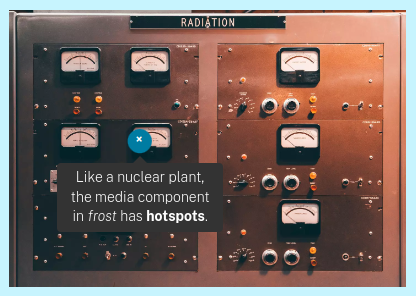
Hotspots are a fun addition to the media component that let you place responsive dots that show a tooltip when hovered or clicked.
Design notes:
- The indicators for hotspots should be small, so as not to obscure too much of the media they’re on top of
- The indicators have a plus that rotates to resemble an ‘x’ when the tooltip is open. This need not be the way the designs remain, but is a decent starting point
- There may be a benefit to setting the hotspot indicators in a loud color. A more subdued tone may make these interactive elements blend into the media they’re covering
- The tooltips can be styled as well. This is a place where big changes could lose a developer an afternoon, but swapping the background color or something could make it a nicer branded experience
- The hotspots, in order to be flexible and responsive, get placed a percentage width and height from the upper left-hand corner of the media. Usually your first guess is pretty good, but in practice you end up having to tweak the numbers
Media listing
The Media listing works like a lot of the other listing components, but this time with images and stuff. The default behavior is to show a square-cropped thumbnail of the selected media in a side-by-side grid. Clicking on a media item opens it in a lightbox on the page.
Design notes:
- Square cropping images works great for photos with centered focal points, but could be less great for things like a grid of logos. You may want to get the developer to switch the “Image Style” used for the media’s display mode to instead use an image style that only scales the source image, rather than square cropping. The result would be a little less… tidy, but would maintain fidelity of the source image
- This component can be extended pretty easily if you want galleries, slideshows, and other ways of showing a bunch of media. Of course, any enhancement like that would be a scope increase, but cool media display modes is the kind of stuff front-end developers wake up for
Message
The message component shares styles with the Drupal system on-screen messages/alerts. For some use cases it might make sense to style the two things separately, but overall folks seem happiest when both have the same styles.
The component has a WYSIWYG for the contents of the message, plus one setting:
- Severity, which lets you assign the message as a status, warning, or error
There are a few nuances to both the system messages and message component:
- Out of the box it’s a light color background with a darker shade for the text and border. All the corners are square rather than rounded: so rounding the corners is an easy way to punch them up
- Message components as dismissible, and stay dismissed if a user closes them, so anything that should persist on the page should probably not be in a message component
- Since the defaults here use color text, any links in the message body as set to inherit the current color. This isn’t a strict requirement, but makes styling between instances of frost a touch easier
- Since the message body is a rich text WYSIWYG, designs of the component might benefit from exploring what is does, and should look like when somebody puts way too much information with way too much formatting inside of one of those things
Product listing
A Product listing works just like a Content/Term/User listing, but shows products from the site’s pre-installed ‘Commerce’ section. If your site doesn’t use frost’s e-commerce functionality, you can safely ignore this component.
If you are using frost for e-commerce, the notes about Teasers in the Content listing section above apply to product teasers as well. Product teasers can be set up to show the price and “Buy now” CTA button instead of the article teaser info like byline, since who authored a product page and when is a lot less important than how much the product costs.
Like the other listing components, a Product listing can be shown stacked, side-by-side, or as a simple carousel. If you intend to have a few product carousels on the site, this is a place where you’ll want to specify a JavaScript carousel library.
Rich text
Finally, an easy one! The Rich text component gives you a WYSIWYG CKEditor for easily writing some everyday HTML.
The WYSIWYG has a decent number of bells and whistles to accomplish your usual formatting needs, but out of the box tries to limit the number of formatting buttons somewhat. This is meant to encourage authors to use the components instead, when the components have an advantage over a WYSIWYG. This is true for things like headings and media.
The Rich text component has some settings that can apply to all the text entered in the WYSIWYG:
- Font size, in the event you want some text on the page larger or smaller than the body text default
- Font weight, for making especially-thin or especially-bold text sections, though this depends on using a variable font as recommended earlier in the post
- Text color, which is the full list of brand colors. Stripes and layout columns let you pick dark or white text but not the full brand palette. If you really need green text somewhere on a page, this is the dropdown for you
- Text columns, for setting some text in 2,3, or 4 columns on desktop. Text on the web isn’t especially friendly when set in newspaper-like columns, so this is an option to be used rarely to make a little section of text pop while taking up less vertical space, rather than a technique to be used everywhere on the site
- Text transform, which works just like the same option on headings. If you anticipate having a block of all-caps text, this dropdown is a good way to accomplish that without typing everything in all-caps
Here are a couple extra notes for handling the overlap between things the WYSIWYG can do, compared to things the component system can:
- Drupal has this concept called “Text formats & editors” that lets you set up multiple WYSIWYGs with different buttons. In frost we have the default “Filtered HTML” editor with a limited number of buttons. The “Full HTML” format has an editor with all the buttons, including the irresponsible ones
- If you make a layout and put rich text in one column and an image (Media) in another, the columns always end up separate. Sometimes you want text to wrap around an image using old-school floats instead. This can be done by inserting an image into a WYSIWYG. If the overall design is going to have a lot of wrapped images like this, that’s something to flag early so the developer can prepare
- I’ve found that, if a developer is a big advocate for WYSIWYG editors and wants to put all the content editing features in CKEditor rather than breaking out components another way, authors and users are probably going to have a bad time. When in doubt, component it out
Spacer
Spacers are versatile ways of introducing vertical whitespace between other components in a configurable and responsive way.
Design notes:
- As discussed in the earlier ‘Layout’ section, frost leans on horizontal spacing being set by columns and other component settings. This opens up spacers to be used specifically for extra vertical spacing
- Spacers can be set to 1x, 2x, 4x, 8x, 16x, and 32x, with the three biggest sizes being responsive: on small screens they’re half their desktop height. In practice, we’ve found that small spacers should stay the same size on mobile, but larger vertical spacers should be shorter on mobile. Unless there’s a good reason to change this up, I’d recommend giving this setup a shot before changing it
- Spacers can be stacked without issue in most places, so if you need a 30px vertical space you can place a 1x and a 2x as a stack. If there’s a good reason for spacing on the site to use lots of 30px (or other somewhat-arbitrary size), it might make sense early on to tweak
--spacing--singleor augment other CSS values so stacks aren’t necessary - The driving force behind having spacer components stems from something that happened in QA all the time before we had them in our toolbox: most of the designers’ notes about how the implementation differed from the original mocks tended to be small differences in vertical spacing. With spacer components we can tweak vertical spacing without writing a bunch more CSS of increasing specificity during the QA phase
- Another advantage here is that we can increase the space between components at any time, just to ensure the breathing room between, for instance, a paragraph of text and a CTA button, feels rhythmic and comfortable, even if it differs from the original design
Table
Before clicking into the settings tab of the Table component and seeing the weird junk tables can do out of the box, there are a few main things to touch on when it comes to tables:
- It’s been around 15 years since it’s been in any way acceptable to use HTML
<table>s for page layout, so hopefully it’s not surprising that the table component here is set up specifically for storing and displaying table data only - In order to comply with accessibility requirements and be a good internet citizen, any table design must have a brief, descriptive caption above the table, then a header row where the prominently-styled cells describe what’s in their column
- The tablefield module, which frost uses for this component, has extension modules that allow for things like HTML markup in cells and setting up colspan and rowspan (HTML’s way of merging cells). These modules are turned off, though, because those feature could be seen as encouraging the kind of table-misuse behaviors I was just talking about. If you have a legitimate edge case for using those features, you developer can enable them
The component has a streamlined way of entering table data, plus the table caption and other info. If you have a lot of data, the “Import from CSV” feature will come in handy.
As far as settings go, the table itself isn’t set up to be modified at all. However, the interactive charts and graphs have some options:
- The chart can have a Chart title that’s distinct from the table caption, to describe what the chart shows
- You can choose between a few chart types, though you only can show one chart per table: vertical bar, horizontal bar, pie, line, and stacked
- There’s a checkbox to Replace table with graph, which visually hides the source data table in favor of the chart
- Since the x-axis label is most often the text in the top left cell of the table, there’s a Y Axis label field for describing the scale of the data
As noted in the color section of the base styles way earlier in this post, the charts and graphs use an auto-generated color scheme based on the --color--main hex code that’s usually pretty appropriate for the site theme. You can provide the developer with your own hex codes instead, if you want full control over the chart colors.
Otherwise, here are some design keys regarding both tables and the charts:
- The charts are generated by the Highcharts library. While Highcharts has an API and styling selectors, I’d recommend avoiding trying to customize the charts much, if at all, beyond picking a color scheme. It’s a real here by dragons part of the frontend codebase
- While you can design the data tables any way you like, I’ve found over the years that, since tables aren’t usually used all that much and the markup is kind of complex, simple table designs make everyone happier, including end-users
- The table component has a wrapper
<div>that shows the table in the horizontal scroll box on narrow tablets and mobile devices. Other responsive table strategies are available, but that’s the one currently in place, so without increasing scope you have that going for you. If you’re using lots of tables and need a more streamlined approach, that’s another thing to discuss with your developer as early as possible - Tables are great for what they’re good for, but… if you’re using lots of tables and charts and graphs it may be a sign that either you’re a data-driven site, or that you’re mis-using the feature. Something to look out for
Term listing
Gonna level with you: the Term listing component exists mostly to fill out the list, rather than being something anyone might use with any regularity. Taxonomy terms like ‘tags’ in frost have Names/titles, short body text, a field for a teaser image, and all the things you’d need to render them as teasers, so…
Yeah, you can make listings of tags as teasers and make the stacks, side-by-side, or carousels. Clicking a teaser takes you to that tag’s listing page, which itself is a little bit of content followed by side-by-side teasers of tagged content.
The advice in the “Content listing” component section about coming up with a sort-of-generalized ‘teaser’ style comes into play here, since a well-designed teaser style means this component will just work, even if you didn’t do anything specific to design for it.
User listing
Ditto all the stuff from the “Term listing” component section above for the user listing. If your teasers look good, you get robust little lists of users for free.
Unlike the term listing, though, there’s a common-enough use case for user listings to highlight that it might make sense to account for a user listing (and user teasers) in your designs:
If you have an About page that lists your company leadership or overall staff, a user listing can help automate keeping it updated. Each user can manage their own little profile with a biography and portrait and the like (and administrators can also manage those profiles). If those profiles should be publicly-viewable, and especially if the staff also author content like blog posts, user listings and profiles and stuff can be a great way to keep your users clicking through pages that interest them.
View
Views in Drupal are flexible displays that can be context-aware, so you can make a blog listing that auto-updates when new content is added, or make a custom interface for your search page. frost comes out of the box with a bunch of useful Views displays that we’ll cover in a separate post, but overall Views embedded via this component will reuse other component styles, like:
- Field with label
- Teaser
- Table
- Stack/side-by-side/carousel layout
- Pager
- Form
- …and others
Some quick design notes, given that Views show other components:
- If a Views listing has an ‘exposed’ form for refining and filtering the results, that form will be collapsed by default and available via a toggle button on mobile. This allows for less scrolling and confusion when landing on a listing page on a phone. This is true for all Views except the main search display, which shows the form by default instead
- The frost Views kit comes with Views you may want to place in your designs: 3 related teasers side-by-side, 3 recent teasers side-by-side that can be narrowed to a particular content type to match
- If you’d like to do something clever to show relevant content to users, discussing Views’ power with your developer will almost certainly be a fruitful conversation
Webform
The webform module lets you build flexible forms that get stored on the website and can also be forwarded to admins via email or sent via API to other services.
A big source of confusion among people who aren’t full-time professional Drupal developers is that there are lots of forms on Drupal sites that aren’t webforms. Many of those forms can be easily modified and redesigned away from their default appearance and behavior, but doing so isn’t as quick and easy as making contact forms and stuff with webform.
Additionally, even developers fall into a trap I recommend you avoid: since making webforms is so easy for most anybody, it’s tempting to build out web-app-like functionality using webform, and then do things with ‘handlers’ to perform actions and generate content. This approach works until it doesn’t, as the more you load up webform the more you have to wrestle against it.
Some design notes:
- Like overall Drupal fields (which I may find a place to discuss either in this huge post or elsewhere), forms should start with an overall style: what does a simple textfield look like? Typically you want a label on top, perhaps a light grey placeholder that indicates what kind of input to put in the field (though this can be counterintuitive for users, and some designers misuse the placeholder functionality), and a one-row text box with some padding and a border that can be rounded and all that jazz. And then the form field should likely have some space between it and the next field
- From the general style for any form field, you can then style individual fields as shown in the webform demo of the frost component guide. Things like radios, checkboxes, date pickers, and more are all technically style-able, even if in some cases the default is familiar, usable, and accessible to the most users. Getting really involved when it comes to form styling is a way to increase frontend development scope, but is also a way to make a site feel truly custom
- If you’re planning to use what’s called the “Float label pattern” when the field label is crammed inside the form field until the user focuses on it… don’t. It’s bad, it’s a lot of frontend dev work, and nobody will be happy about it, including many end-users
- A great way to differentiate a form’s appearance, even if things like radio buttons and checkboxes use browser defaults, is to get creative with how
<fieldset>s look. In frost the fieldset’s legend is bold and centered, carrying along the old-fashioned browser style of the legend intersecting the fieldset’s top border, but there are lots of directions you could go, just so long as it’s a box with some legend text that contains form fields related to that descriptive legend
Otherwise, since the webform component is used to insert a form anywhere you want on the page, the design really comes down to how you want forms to look on the site.
Fifth, wrapper
Most sites (that aren’t hand-coded page-by-page) tend to have a similar design concept, and frost is no exception: the content area is set up to be editable, while the header, footer, and sometimes a wrapper or sidebar are elements designed once to match the brand and don’t change much page-to-page. This might seem obvious, but overall it means you can go in any direction you want for the header and footer, even if content authors mess up your aesthetic a bit in the in-between parts.
Of course, the setup that frost ships with isn’t a terrible start:
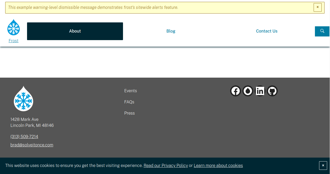
- Header starts with the optional ability to show site-wide alerts, like “We’ll be closed for the fourth of July holiday”
- Main header has the logo/branding, main menu, and a search icon toggle
- Footer has columns for branding and contact info, a secondary menu, and site social icons
- After the main footer is a shorter section for the copyright statement, terms and privacy policy links, etc.
- After the footer and sticky to the bottom of the viewport until you close it is a very general, lightweight cookie prompt
These can all be added, removed, tweaked, and massaged to make a header and footer that direct users to the right places and best convey your site’s brand.
The frost project is working on easy-to-add dropdown and mega menus for the main navigation, but those features aren’t available quite yet, so while you may need those features, technically they will require your developer to make them happen.
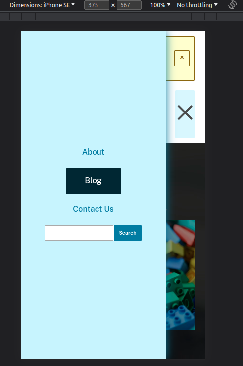
One great way to keep scope in check for the header is to follow the out-of-the-box philosophy for mobile devices:
The main header section can be thought of as two parts:
- The logo/branding block
- A big box holding the main nav, search, and other stuff on desktop, that turns into a sliding ‘tray’ on mobile
The tray gets toggled by a hamburger icon. When the tray is opened, there’s a slick little animation that turns the hamburger into an ‘x’ visually, which is a neat little detail.
What’s useful about this philosophical approach is that you’re not juggling a bunch of different items’ visibility or putting in duplicate blocks or anything, just to accommodate the visual differences between the desktop and mobile designs. You’re just going, “Everything that’s not the logo will be in the hamburger tray, in roughly the same order they appear on desktop, albeit vertically”.
I’ll once again stress that you don’t have to follow this guidance about header philosophy, but doing so is helpful to manage development scope and overall complexity. It’s also pretty good at the whole omnichannel buzzword, where looking at the site on mobile resembles the desktop experience enough that users feel more like they’re on the same site. Some designs deviate enough between desktop and mobile to feel more like two different sites, which some would say is a missed opportunity.
There’s a lot that can be said about header and footer design, but rather than making this post even longer, I’ll leave you with one design note, based on a problem I encountered on two recent designs:
- The copyright statement should be on its own line (with links to the privacy policy and terms), full stop. It is weird to put the copyright statement in a column of the footer, and your design with an abbreviated copyright statement to make the text fit in a column will absolutely lose out to any legal advisor’s guidance, so just keep the copyright statement in the same place as every other website ever
Sixth, page mockups
In case this book of a design handoff blog post hasn’t made it obvious, us developers thrive on precise written comminication. You can endear yourself to developers by annotating your designs with things that aren’t otherwise obvious, or things that are especially important to you so they have the tools they need to get it right.
Right, so bringing together all the components with the header and footer to make various page-level designs is pretty common for getting client approval. With all the words above, you can feel confident you’ve nailed all the constituent parts, so all that’s left if putting the toy bricks together.
Key notes:
- Unless the client firmly demands mobile comps (and the estimate reflects the risk to scope this almost always presents), it’s probably in everyone’s best interest to only do desktop page mocks. In frost responsiveness of the layouts and components comes along logically and for free, so you’ll likely only have to tweak a few things here and there. Designing for mobile specifically usually results in big headaches between expectation and reality, as the designs take more creative liberties than is likely advisable in systems design
- Every page should have a hero containing the page title as an
<h1>, even if the heroes differ somewhat in appearance between different page types - You can throw any combination of storytelling components with any amount of spacing into whichever layouts make the most sense, with the biggest consideration being the appropriate heading levels as illustrated in the heading component section
- I’ve found that using the stripes to alternate between backgrounds for thematic sections (see the frost demo privacy policy for an example) is a great way to organize content while providing visual interest and breathing room. When other colors or images aren’t quite right, alternating between white and light grey for background gets the job done well
Three heroes
One of the coolest parts of frost is a beautifully-coded block that automatically picks the right hero to insert on the page for you. The following three sections describe the kinds of heroes you’ll encounter and have to design for.
Fallback default and ‘system’ pages
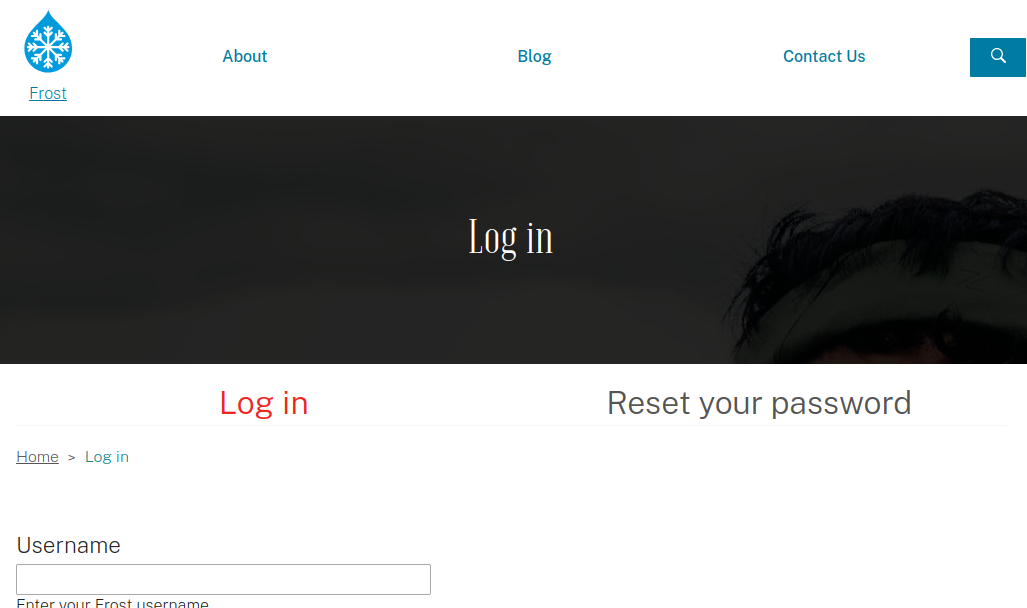
The first hero, and the one that’s the least flexible, is the one that appears on ‘system’ pages:
On pages like the user login, user register, and if you create standalone pages for things like webforms or views, or anything else where you’re not going to an edit screen and moving components around, the only piece of information we reliably have is the page title, so the content of the hero is just the page title.
However, the following notes apply:
- If so desired, the hero’s vertical padding could be smaller on system pages, and other styling can be applied to just heroes on system pages
- The system ships with a CSS class applied to the system heroes that gives it the default background image mentioned in the second section (Assets) of this novel. If you’d rather use a solid background color or a different image, that can be done easily, and it will apply to all non-overridden system page heroes
- While it would take developer time per page, some system pages can have distinct override styles, like a different background image or something like that. Ideally this would be done sparingly, and please resist the temptation to put any content other than the page title in any system page hero design, as that will make the developer very sad
Per-bundle pre-configured heroes
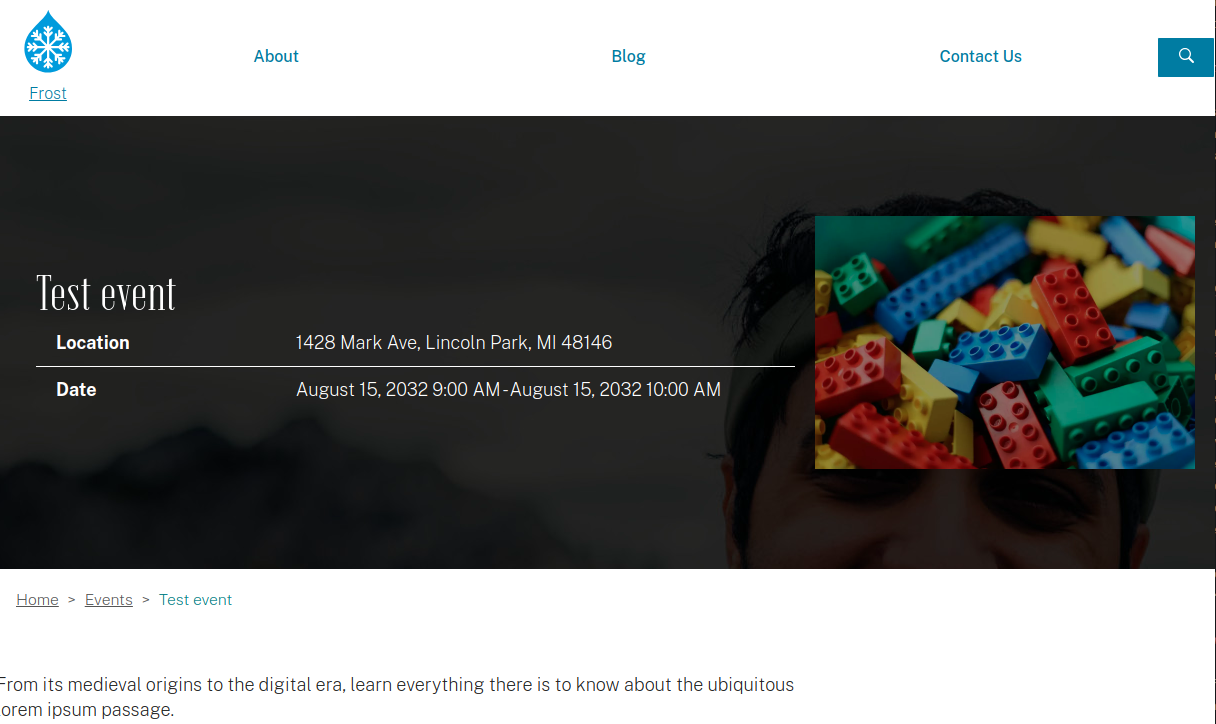
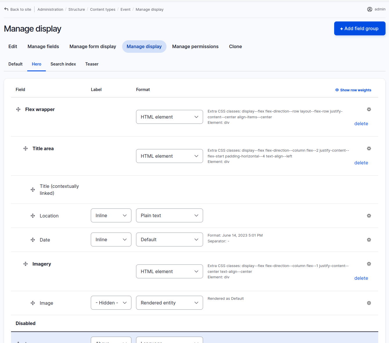
Each type of content: article, event, page, tag, product, user, and more (any ‘entity’ bundle that has its own page) can be set up with what’s called a “view mode” or “display mode” named hero that, when present in the site’s configuration, will replace the “system page” hero style above.
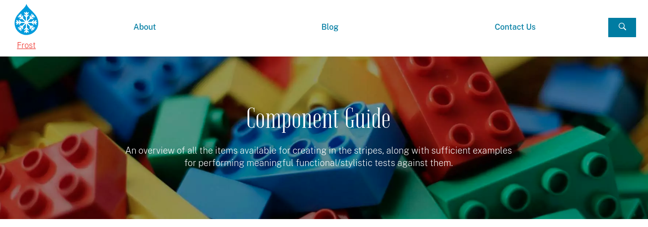
The illustration above shows how the hero for an event appears. An ambitious site builder (or more likely the developer you know and love) can build out the layout from the admin UI, the same way they build out the rest of the page or the teaser:
The hero for a piece of content is a good place to put fields that contain bite-sized and at-a-glance info, like an event’s location and date, an article’s byline, and in many cases the teaser image or social share image for that content (which leverages the psychological principle of priming: you see the image on a social media site or the teaser on a listing page, click the link, then see the same image and go “That’s the same image, I’ve landed in the right place, I’m going to think of this content any time I see that image or ones like it,” at least somewhat non-cynically).
What’s great about these heroes for things like events, articles, products, and tags is that as a content author you want to focus on making compelling content, rather than custom designing a hero every time you want to write a press release, so with this default setup you have something that looks good and is effective at communicating necessary information in a consistent way from page to similar page.
But this is frost, so of course there’s going to be a more flexible and customizable option involving components…
Stripe: Atomic heroes
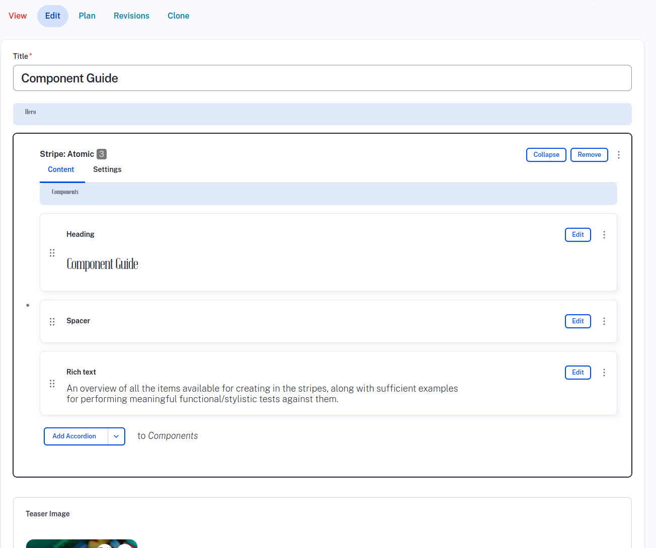
The last hero type, the ultimate override in the beautifully-coded hero block, and by far the coolest hero type, is just using a stripe like all the others:
Anything you can do with an atomic stripe, and any component you can place elsewhere on the site, you can technically place in a stripe hero:
This means you can easily make heroes that have:
- Background images
- Background videos
- Big spacers
- Layouts with multiple columns
- Additional text, media, and components
- Easy-to-edit CTA button links
With great power comes great responsibility, though, so please heed these notes:
- Every hero must contain the page title in an
<h1>tag, and the h1 should probably look like all the other h1 titles on the site, which goes in line with the thing I said about priming in the previous section. The user is getting familiar with what different things look like on the site, so making the hero look consistent helps the user understand the site - You can kind of ignore the previous bullet on the home page specifically. Users expect more of a “This is what we do” tagline in the home page hero. That tagline should have relevant keywords and should have a prominent appearance, and its tag should absolutely be an
<h1>, but it doesn’t necessarily have to look like all the other site h1s - In testing you’ll probably find that busy heroes don’t perform as well as simple, direct ones
- As with any stripe, the background color/image should contrast with the chosen text color
And… that’s all I have to say about that. You survived!
Wrapping up
That was a lot of stuff. Thanks for sticking around!
The big things to take away from this article, aside from the specific notes, are:
- When in doubt, design the smallest pieces first, as they’re then used in combination in larger components
- Since the system ships with reasonable defaults, not everything has to be designed or developed in one fell swoop. If your team is comfortable with it, you can deliver a Minimum Viable Product for the design, then tack on more components and page designs as you go
- There’s nothing that specifically stops you from designing how you always have, with the developer(s) doing the adapting of the mock-ups into base styles and components, but perhaps something in this handoff gave you an idea for tweaking the process or deliverables
- Any component, any style, can be adapted to suit your needs with just a little added development, so take the defaults as a jumping-off point. If the project has a small budget/scope, perhaps err on the side of the defaults, but for an ambitious experience you can dial in the brand and aesthetic
- Hopefully the places where I said “you should probably stick to such-and-such” make sense as being ways to maintain the integrity of the system and keep scope in check, rather than getting in the way of creative freedom or making all sites designed this way look same-y. You can break away from almost any of these guidelines as long as you and the team are okay with the scope implications
We hope you have as much fun designing for frost as we do developing with it!
And of course, if you run into any snags or want to hire Brad for a few hours to iron something out, please don’t hesitate to reach out to [email protected].
